

 Image 1 of 1
Details
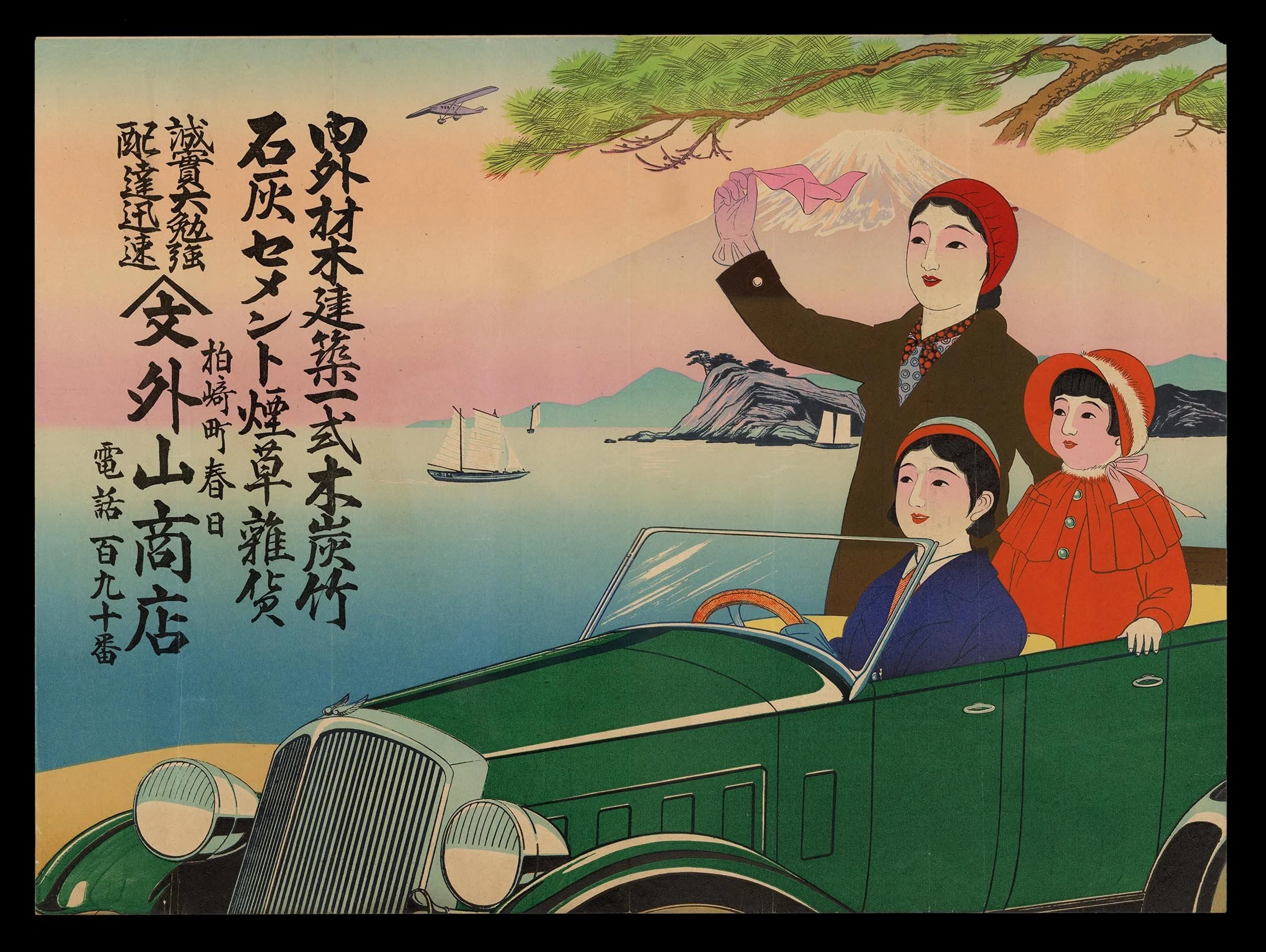
This dynamic advertising poster presents an idealized vision of modern life in early 1930s Japan. Two elegantly dressed women and a young girl ride together in an open green motorcar, their fashionable winter attire rendered in vivid tones of deep blue, scarlet, and orange. One woman waves a pink scarf into the coastal breeze while Mount Fuji rises calmly in the distance, framed by pine branches overhead and animated by the passing silhouette of a monoplane. The juxtaposition of natural landscape and modern technology reflects the visual language of interwar advertising, where speed, travel, and leisure became symbols of prosperity and sophistication.
The inclusion of the child is particularly significant. Unlike many commercial images centered exclusively on the liberated modern woman, this composition broadens its appeal through the depiction of family life and generational aspiration. The young girl in orange, bundled in Western-style winter clothing, introduces an atmosphere of warmth and domestic optimism that softens the otherwise cosmopolitan tone of the scene. Together, the figures suggest a vision of modern consumption extending beyond youthful glamour toward the emerging middle-class family culture fostered by regional department stores during the early Shōwa period.
The text advertises a surprisingly varied inventory, including cement, tobacco products, and assorted commercial goods. Such eclectic offerings were characteristic of provincial department stores seeking to establish themselves as centers of modern living rather than mere retailers of luxury items. The advertisement promotes not simply merchandise, but participation in a changing society increasingly shaped by mobility, industrial expansion, and consumer aspiration. Though executed through traditional woodblock printing methods, the composition embraces the bold simplification and graphic immediacy associated with modern advertising design, revealing how older printmaking techniques adapted seamlessly to contemporary commercial culture.
Connoisseur's Note
Perhaps the most compelling aspect of this poster is its sophisticated orchestration of visual movement across the sheet. The sweeping diagonal of the automobile, the raised arm of the standing figure, the drifting scarf, and the distant airplane collectively generate a sensation of forward momentum that energizes the entire composition. Even the placement of the typography contributes to this rhythm, balancing the expansive openness of the landscape with dense vertical calligraphy. The designer demonstrates a refined understanding of how commercial imagery could command public attention while maintaining visual elegance.
The color structure of the work is equally noteworthy. Rather than relying on excessive ornamentation, the artist organizes the composition through carefully controlled areas of saturated color set against pale atmospheric gradients. The brilliant orange of the child’s coat acts as a visual counterweight to the dark green automobile, while the softer pinks and blues create a sense of airy clarity associated with contemporary travel posters and department store advertisements of the period. This restrained yet highly strategic use of color reflects the growing influence of international graphic design trends circulating through Japanese print media during the late 1920s and early 1930s.
As surviving objects, commercial woodblock posters of this kind remain exceptionally scarce. Intended for temporary public display, most examples were discarded after use, particularly those issued by regional merchants outside major urban centers. Their rarity today grants them considerable documentary importance, preserving the aspirations, marketing strategies, and visual sensibilities of everyday commercial life during Japan’s interwar modernization. The present example is especially evocative for its seamless fusion of family imagery, scenic nationalism, and consumer fantasy into a single highly polished composition.